
| Subject | Re: Another step towards Windows |
| From | Lloyd Parsons |
| Date | 09/03/2014 19:52 (09/03/2014 12:52) |
| Message-ID | <c6p2qmFidgoU1@mid.individual.net> |
| Client | |
| Newsgroups | comp.sys.mac.advocacy |
| Follows | Sandman |
| Followups | Sandman (15h & 39m) |
On 3 Sep 2014 05:45:32 GMT, Sandman wrote:
SandmanWhile that is true, the differences weren't as pronounced as they are In iOS 7 today and iOS8 and OSX Yosemite of tomorrow.
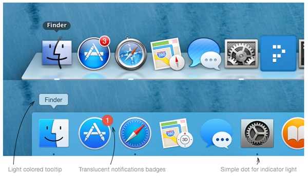
In article <c6mlsrFtl4pU1@mid.individual.net>, Lloyd Parsons wrote:Just to put some images behind those words, here's some of the differences:<>
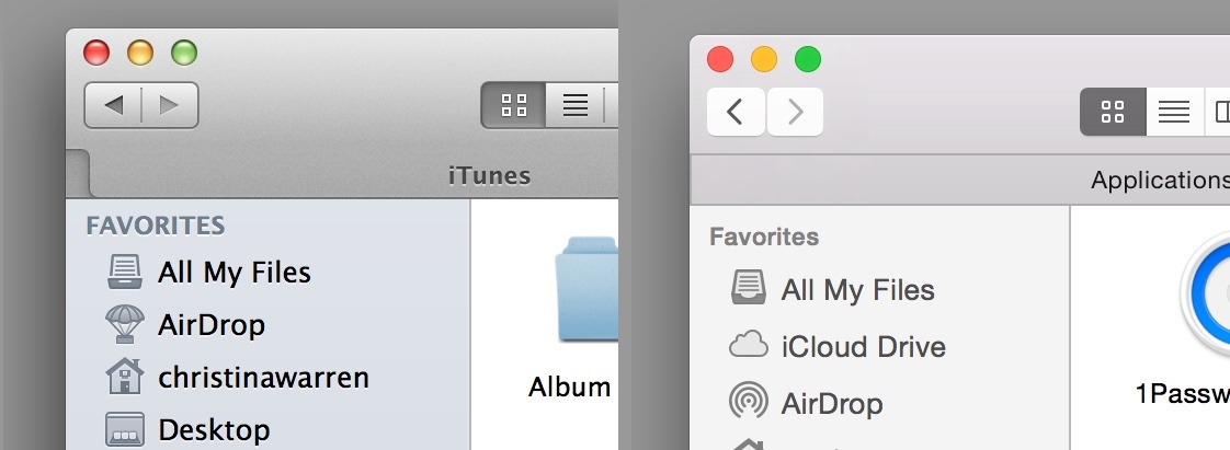
And since we've established that it's not the "flatness" itself that you're having problems with (since Windows Phone is the definition of super flat), it's something else.You've talked about "pastel colors"; but the color scheme is pretty much identical in that screenshot. Here's another:<>
Again, less 3D, same exact colors.Again, I'm not trying to change your mind here, I am trying to understand why Yosemite is ugly and Mavericks is pretty when the only difference I can make out is that Yosemite is more flat, which just can't be what you're in reference to, given the platform you're moving to.So, as I've said - I'm obivously missing something about this "ugly" thing, and while I don't expect to agree with you, I would really like to understand your claims.Lloyd Parsons
A couple things to note on the newest Windows Phones with WP8.1. 1. Transparent tiling, very nice as I said in a previous post. Gives A much better overall look and feel to the start screen and certainly Much more lively and colorful that the iPhone. Overall the iPhone 'start' screens are fairly mundane now in comparison to WP and Android.2. Very eye-popping colors everywhere, not so anywhere on the iPhone.Sandman
Sure, you like lots of colors, that's fine. But that's not something "new" or something that Apple has changed. iOS and OSX has never been particularly colorful.
You gace the impression that due to the direction Apple is currently going, iOS/OSX is becoming "ugly" and Windows Phone is "pretty", so you switched. But so far, nothing you've said has illustrated this change in any way.It has, you just don't agree with my conclusions or comments. So you've decided to pick a few nits here and there.
You're now talking about WP being more colorful than iOS, which it most certainly is - but then again, it has *always* been that, so there no obvious reason why you should have switched today rather than three years ago.Sure there is. 3 years ago the colors weren't as washed out and all Pastel as they are now and going forward. Now if you disagree with That, I really have to question your credibility about why your are so Dogged in your pursuit of this.
No, in fact Safari hasn't looked like this in the previous versions. On the phone for me, that isn't anything to worry about as browser Pretty much suck on all phones IMO. And this shading of washed out Colorings is all over the place in the new OS's from Apple and in their apps.Lloyd ParsonsSandman
Then on the computer, just Safari is enough to make your eyes strain. Tabs are barely separated and the shading between active and non-active tabs is almost nothing at all on a non-retina screen. Discernible on the Retina screens though.
Fine, but then again, this is how they have looked since forever. Nothing have changed, or is changing, with regards to the "shading between tabs" in Safari. I'm perfectly fine with you disliking this part of one application on OSX, I just have a hard time understanding how this can be the sole reason for switching?
I.e. I would have been totally ok with you posting about "Hey you guys, I've moved to WIndows Phone now. Frankly, I think it looks better" but you've been alluding to the direction Apple is going, as if they're changing something and you want to blame this change for your switch. But you've been unable to quantify that.Who actually cares if you are OK with me switching? I don't recall Mentioning that as an issue for me. You think it looks better, I don't, I think it looks worse.
And if Retina screens were on all new devices from Apple, it would make very good sense and provide an impetus for users to get new Hardware. But there isn't any solid evidence that Retina screens are Going to be on all devices though there are some weak rumors.Lloyd ParsonsSandman
Basically in most forums the gut feeling is that Yosemite has been more optimized for Retina screens over the others, yet only some of the laptops even have Retina screens.
This may be true, I haven't tested Yosemite enough to have an opinion about that. Retina screens are the future, so it's not illogical to assume this.
You keep saying that, but I've yet to see it in anything else as skinny as it is on iOS7 and Yosemite. Provide some links to place and Things using it that are not big screens or big pictures or whatever.Lloyd ParsonsSandman
Of course once you're in an app, the app is controlling most of this. Which means that 3rd party Apps look and feel hasn't changed while most, if not all, of Apple's Will either at launch of Yosemite or soon thereafter.
Change from what to what? Pretty to Ugly? They're using the same color palette, but are using a lot less 3D-ish design. And I have a hard time imagining that you're complaining about them becoming flat while talking about switching to Windows. :-DLloyd ParsonsSandman
The new default font may have been around for quite awhile, but after Seeing it in Yosemite, I can understand why I never saw it used Anywhere.
Again, this is Helvetiva Neue, you're seeing it *everywhere*. It's one of the world's most famous font faces.
Then I disagree with those designers. But since you've only claimed How widely it is used and provided no actual proof, the jury is out on That.Lloyd ParsonsSandman
To say it sucks would not even come close to how bad I perceive it.
Fine, you don't have to like the font, but designers all over the world disagree with you.
Mostly because you figure that only the very patient or idiotic would Keep going after you blather on I suppose... :)Lloyd ParsonsSandman
Lastly, I have made the change for reasons that I perfectly understand.
Very good. I've been trying to get you to tell us about them for a couple of days now. Unsuccessfully so, though. :)Lloyd ParsonsSandman
That you don't seem to is not of a concern to me and I Will not keep going in this somewhat drifted thread on this particular Part.
Again, I didn't expect you to, either.
--
Lloyd from SurfacePro via NewsgroupsRT
 08/28/2014
-