
| Subject | Re: Another step towards Windows |
| From | Sandman |
| Date | 09/03/2014 17:25 (09/03/2014 17:25) |
| Message-ID | <slrnm0ed63.o4q.mr@irc.sandman.net> |
| Client | |
| Newsgroups | comp.sys.mac.advocacy |
| Follows | David Fritzinger |
| Followups | Lloyd Parsons (6m) > Sandman David Fritzinger (46m) > Sandman |
In article <dfritzin-93678A.09533203092014@news.eternal-september.org>, David Fritzinger wrote:
Sure, let's look!SandmanDavid Fritzinger
Sure, you like lots of colors, that's fine. But that's not something "new" or something that Apple has changed. iOS and OSX has never been particularly colorful.
Err, look at early versions of OSX. They were quite colorful, and Apple has been toning down on the color ever since. [snip]
<
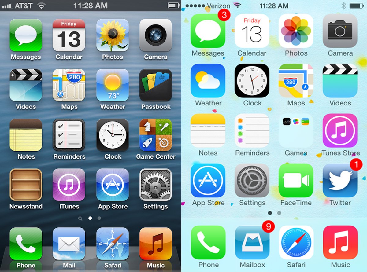 >
>Here's iOS 6 vs iOS 7, and as we know, iOS hasn't changed it's UI design since it's inception up until iOS6, so this is valid as a comparison betwen iOS from the start to iOS7, but it's easier to see with two retina screens.
As you can see, there is in no way more color in earlier versions of iOS. If anything, iOS7 is more colorful than iOS6 since it doesn't cover the colors with gloss and graidents.
Take the iTunes Store icon for instance, where the iOS 7 icon most certainly has a stronger color than the iOS 6 one, which has a flare and a glossy gradient covering the color.
As I said, iOS7 is less 3D, and some icons, such as Calendar, Reminders and Notes have less color, but other icons have more color, like Photos and Maps, or stronger color like I mentioned.
iOS6 has more *depth*, more "presence" if you like. It has a 3D style that many people liked (me included), shading, shadows, but not more color.
So, looking at this, it should be clear that iOS7 doesn't have less color than earlier versions. And looking at my earlier OSX screeen comparison, the same is true for OSX as well.
Starting to see how I think the original claim is a bit... wobbly? :)
-- Sandman[.net]
 08/28/2014
-